Dashboards and Analytics
Dashboards combine query results, entity lists, and metric time-series charts into customized, interactive operational views.
Whether you need a high-level executive summary, a real-world server monitoring wallboard, or a team SLA portal, Dashboards allow you to drag, resize, and configure visual blocks.
1. Available Dashboard Block Types
Section titled “1. Available Dashboard Block Types”| Block Type | Description | Best Used For |
|---|---|---|
| Stat Block | Single KPI metric number with optional trend indicator (e.g. Total Revenue, Active Incidents). | High-level status counters and goal targets. |
| Chart Block | Interactive line, bar, or area time-series plot. | Visualizing CPU %, sales revenue, or latency over time. |
| Gauge Block | Radial speed/percentage meter showing min/max bounds. | Operational capacity, disk usage %, SLA target meters. |
| List Block | Filtered entity table list displaying specific columns. | Recent support tickets, active alerts, server inventory. |
2. Step-by-Step: Building a Dashboard
Section titled “2. Step-by-Step: Building a Dashboard”- Navigate to Dashboards → Search via the navigation launcher.
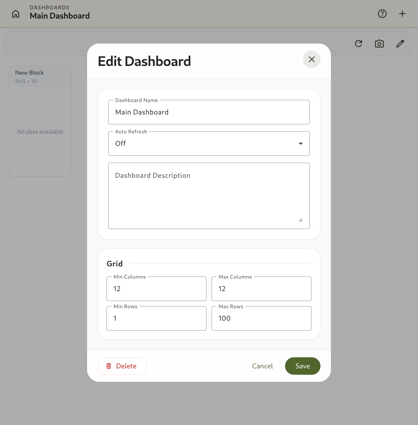
- Click + Create Dashboard.
- Enter a title (e.g.,
Infrastructure Operations Portal) and description. - Click + Add Block:
- Choose a block type (Stat, Chart, Gauge, or List).
- Select the target Template (e.g.,
Server Node). - Configure metric aggregation function (
AVG,SUM,COUNT,MAX,MIN). - Set custom time range and refresh interval.
- Drag and Resize: Drag blocks across the grid layout to position them.
- Click Save Dashboard.